


Nicoletto’s CPG Packaging &
Restaurant Branding
Restaurant Branding
As long-time friends of Danny and Ryan Nicoletto, founders of Nashville’s Nicoletto’s Pasta Co. and Italian Kitchen, we helped them design their first logo in 2015 as they transitioned out of the music business and into the pasta business. So when they rang us up about expanding and updating the restaurant branding, we were excited to pick up where we left off. With new restaurant locations set to open and a fast growing wholesale vertical serving gourmet and specialty grocers across the U.S., they needed to level up their visual identity, restaurant collateral, and CPG packaging to be well positioned for their next phase of growth.
Nicoletto’s Rebrand Scope:
— Strategy
— Logo, Typography & Color
— Packaging, Menus & Printed Collateral
— Signage & Environmental Graphics
— Messaging
— Illustration
— Brand Guidelines
— Logo, Typography & Color
— Packaging, Menus & Printed Collateral
— Signage & Environmental Graphics
— Messaging
— Illustration
— Brand Guidelines
Additional Credits:
— Packaging photography by Scott Snyder Photo
— Location and food photography by Kelli Dirks
— Mural painted by Murals By Loba
— Location and food photography by Kelli Dirks
— Mural painted by Murals By Loba

Nicoletto's Italian Kitchen — Donelson, TN Location
About Nicoletto’s
Nicoletto’s Pasta Co. was founded in 2014 by brothers Danny and Ryan Nicoletto to honor their late father and their Italian roots. Since opening their small batch pasta factory, they’ve become a staple in the Nashville scene, collaborating with chefs; supplying pasta to hot spots like Lockeland Table; feeding firefighters, first responders, and displaced families after the 2020 Nashville tornado; and regularly being included in Nashville’s Best year-end lists. They opened their first restaurant location in East Nashville in 2016 and quickly became a favorite for their quality, fast casual food, and late night hours. The brothers both have roots in the music industry, so on any given day you might find Catfish and the Bottlemen or Grace Potter in line ahead of you grabbing a pasta bowl
before a show.
Logo
The Nicoletto’s logo has a feeling of heritage and premium quality. We also developed secondary seals that celebrate Nicoletto’s roots and selling points.

Brand Tone and Visual Language
The Nicoletto’s brand voice reflects its founders, Danny and Ryan: focused on great quality without the high brow, pretentious BS. The messaging is easy-going. The color palette is classically Italian, drawing from vintage Vespa paint colors paired with stark black and off-white type. Typography is casual but elevated, featuring our own fonts Santa Ana Sans and Beverly Drive Right, and Mike Breen’s P22 Mackinac for body copy.
Typography & Color

Wholesale & Packaging System

Bigger Diecut Window
The window of a Nicoletto’s box is purposefully double the size of most competitors. You can easily see the beautiful, tasty, bronze-cut dried pasta noodles.
Scalable Packaging Design System
Nicoletto’s packaging system features a consistent retro, Italian inspired design, with pasta cuts differentiated by color. On grocery shelves this makes for a gorgeous, curated rainbow, like a lineup of vintage Vespas, that stands out from the other brands.


What Nicoletto’s wholesale vendors are saying…
★★★★★
“Only had the pasta in store for a couple of days and it’s flying off the shelves!”
“Only had the pasta in store for a couple of days and it’s flying off the shelves!”
★★★★★
“Delicious, adorable”
“Delicious, adorable”
★★★★★
“Great product, moves well”
“Great product, moves well”

Nicoletto's Dried Pasta packaging and Marinara Sauce label dielines.

Demistify “Bronze Cut”
Many pasta brands tout bronze-cut noodles, but what does that mean? We saw an opportunity to connect with the younger demographic of shoppers that love high quality food, but may not be as versed in the lingo. In short: “Bronze-cut holds more sauce.” And truly, who doesn’t want that?

Nicoletto's Marinara jars are consumer packaged goods at their finest.
Illustration Style

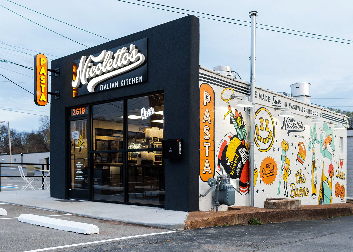
Placemaking, Signage, Murals and More for Nicoletto’s Italian Kitchen Restaurants
Each Nicoletto’s location is unique, with menu offerings often varying by location. We set up a design system that made opening new locations easy while still creating consistency with the core restaurant branding. This included layouts for:
— menu boards
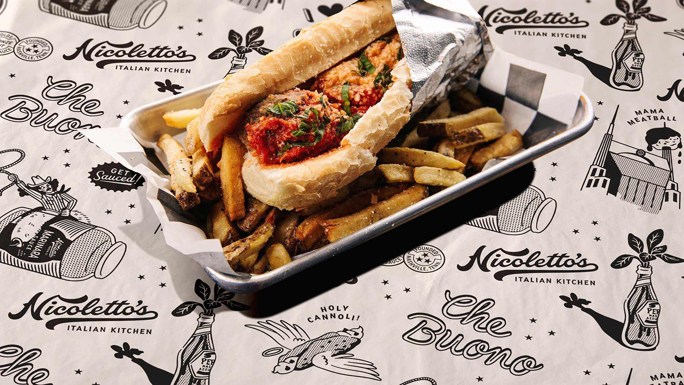
— illustrations for tray paper, locations, events, etc.
— fresh pasta boxes
— various interior and exterior signage
— mural design
— illustrations for tray paper, locations, events, etc.
— fresh pasta boxes
— various interior and exterior signage
— mural design


Nicoletto’s fresh pasta boxes for daily pasta specials in the restaurant locations.

The Nicoletto’s noodle mascots we designed in 2015 as life-sized cardboard cut outs.


As Featured on Brand New and The Dieline
"Although the logo was designed in 2015 we can still take a couple of minutes to appreciate it because part of what’s great about it is that it could have been designed in 2023 or it could be designed in 2031 or in any other increment of 8 years past or future and it would still look great thanks to its timeless script approach...flawlessly done." - Armin Vit, Brand New


